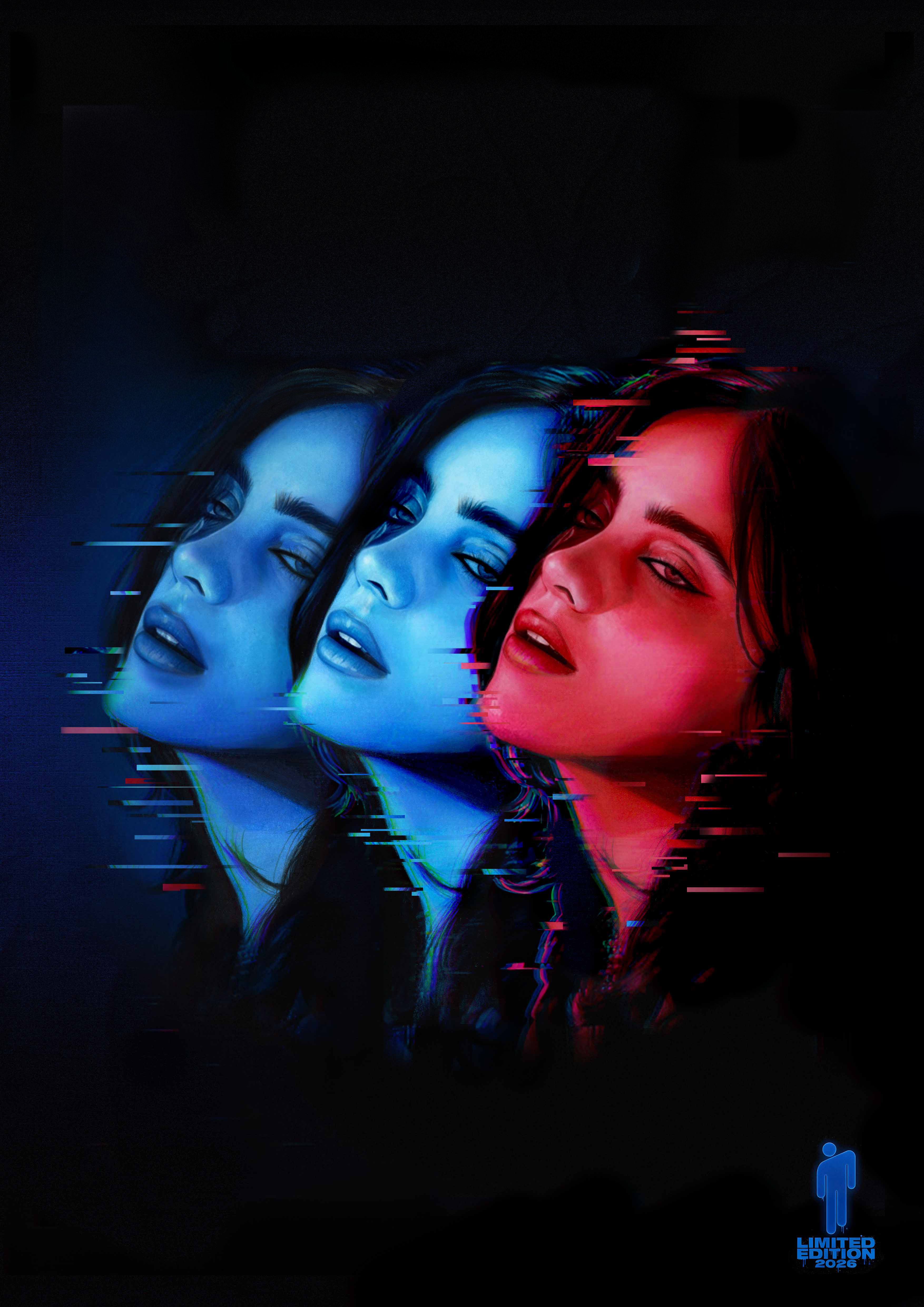
Final Concepts
Two directions were developed for the project. After initial feedback on the first concept, I created a second version with a different approach.
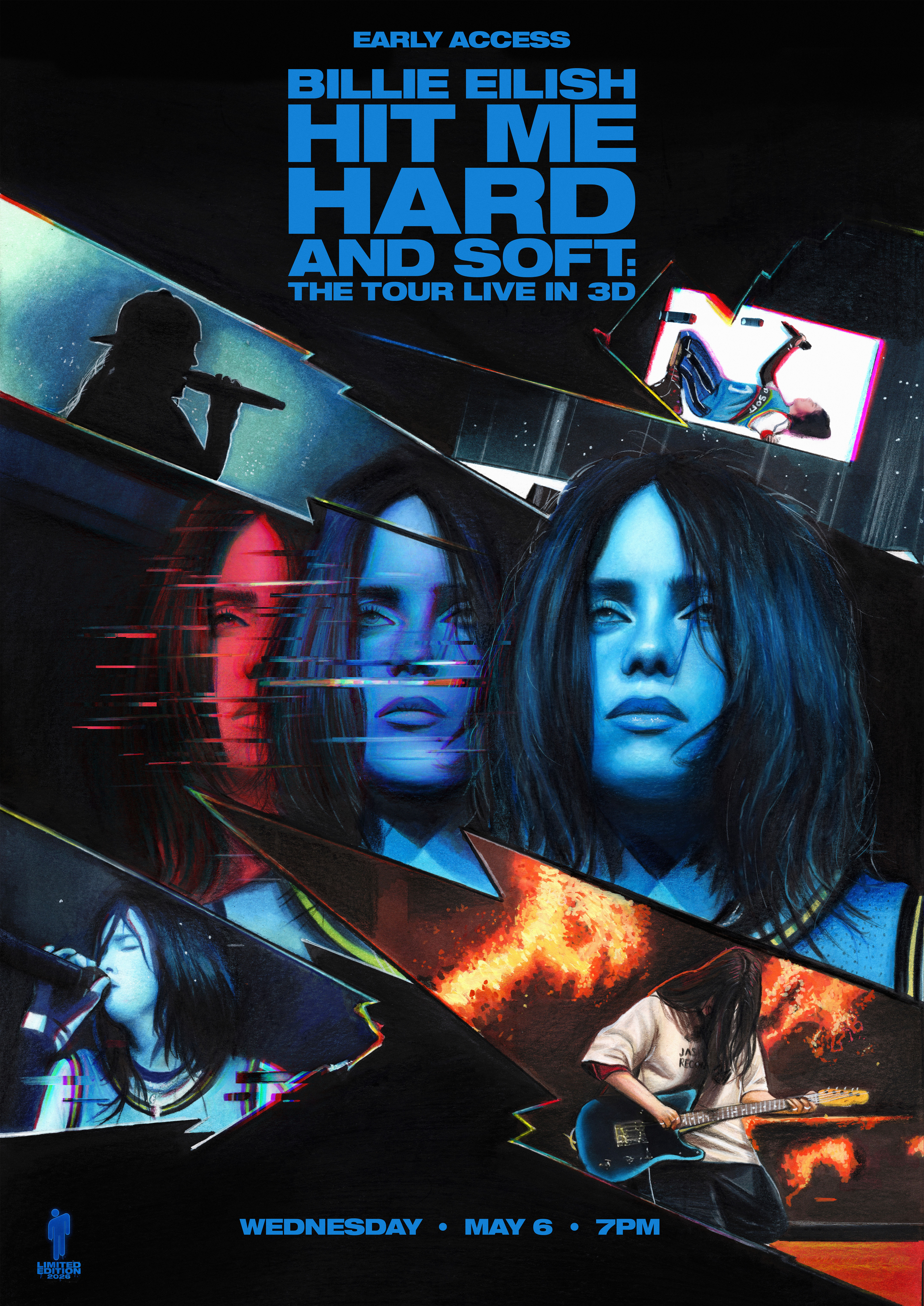
Concept 1 — Multi-layered composition with performance elements and glitch treatment
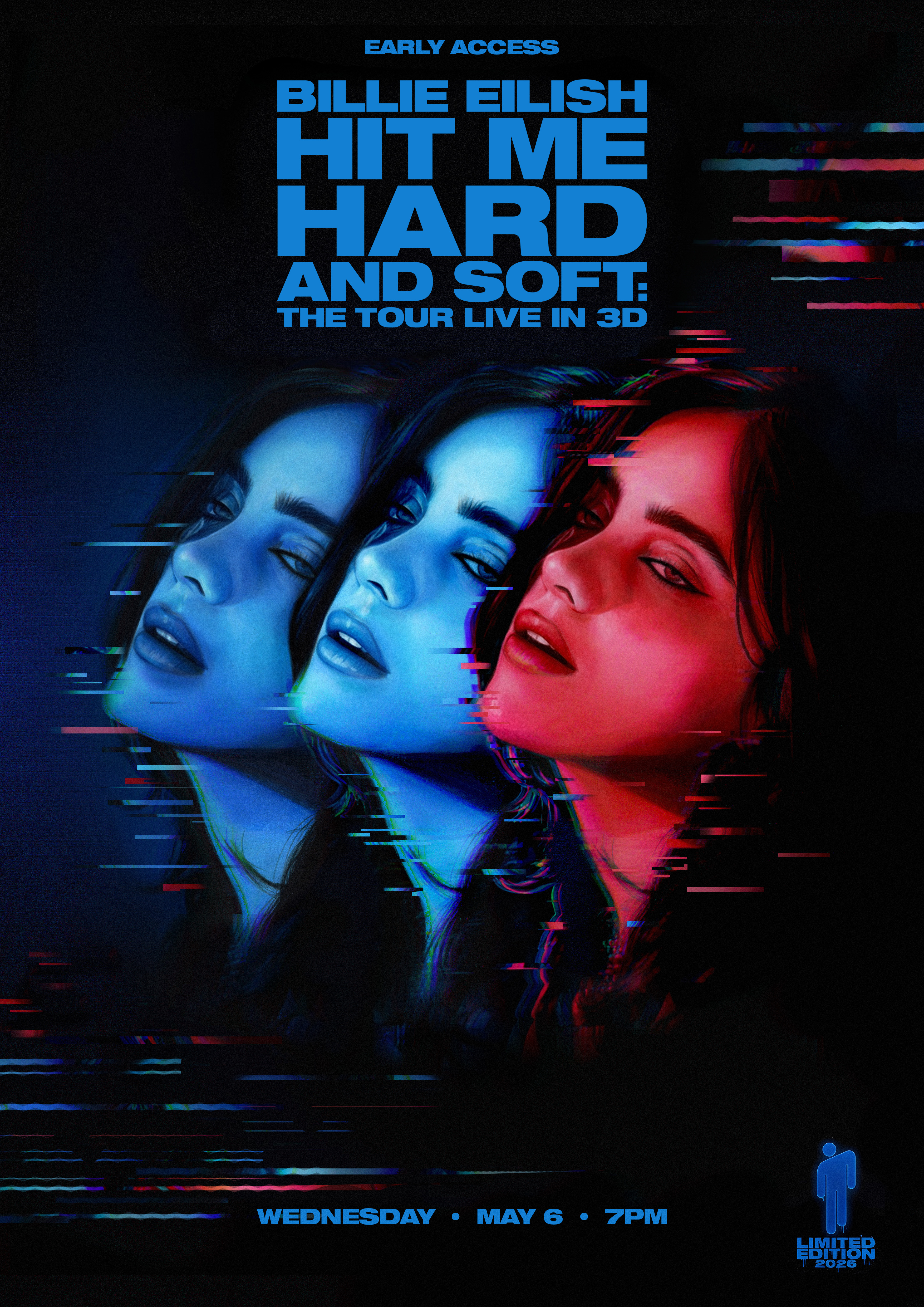
Concept 2 — Focused portrait approach
Overview & Brief
Commissioned by Paramount Pictures to create original poster art concepts for the theatrical release of Billie Eilish – Hit Me Hard and Soft: The Tour (Live in 3D) The concepts were not selected for the official campaign.
The goal was to capture both the album's emotional depth and the cinematic energy of the live shows, while combining it with a handmade portrait with digital glitch effects.
Initial Sketches
Early exploration of composition, framing and layout for both directions.
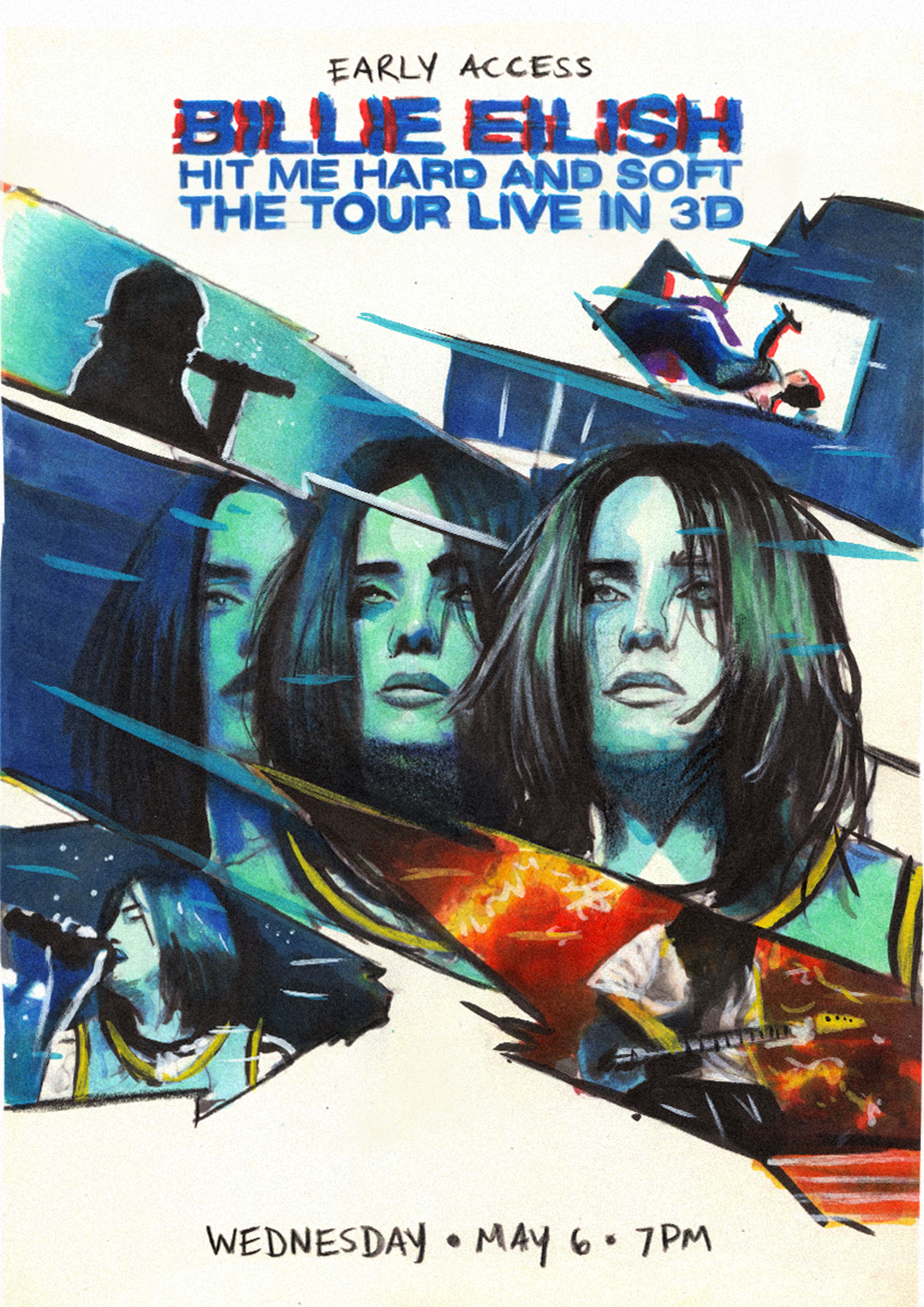
Concept 1 — Composition & element planning
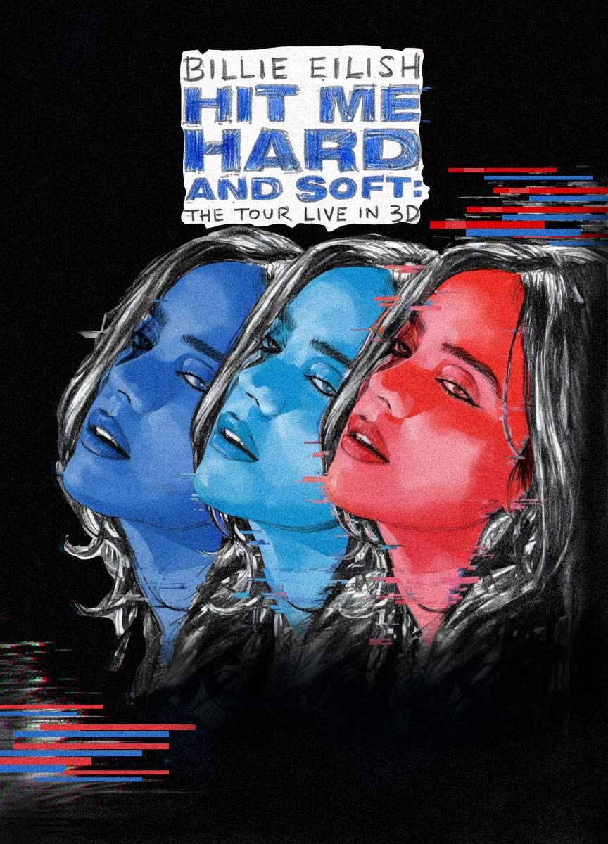
Concept 2 — Portrait layout & framing study
Work in Progress — Concept 1
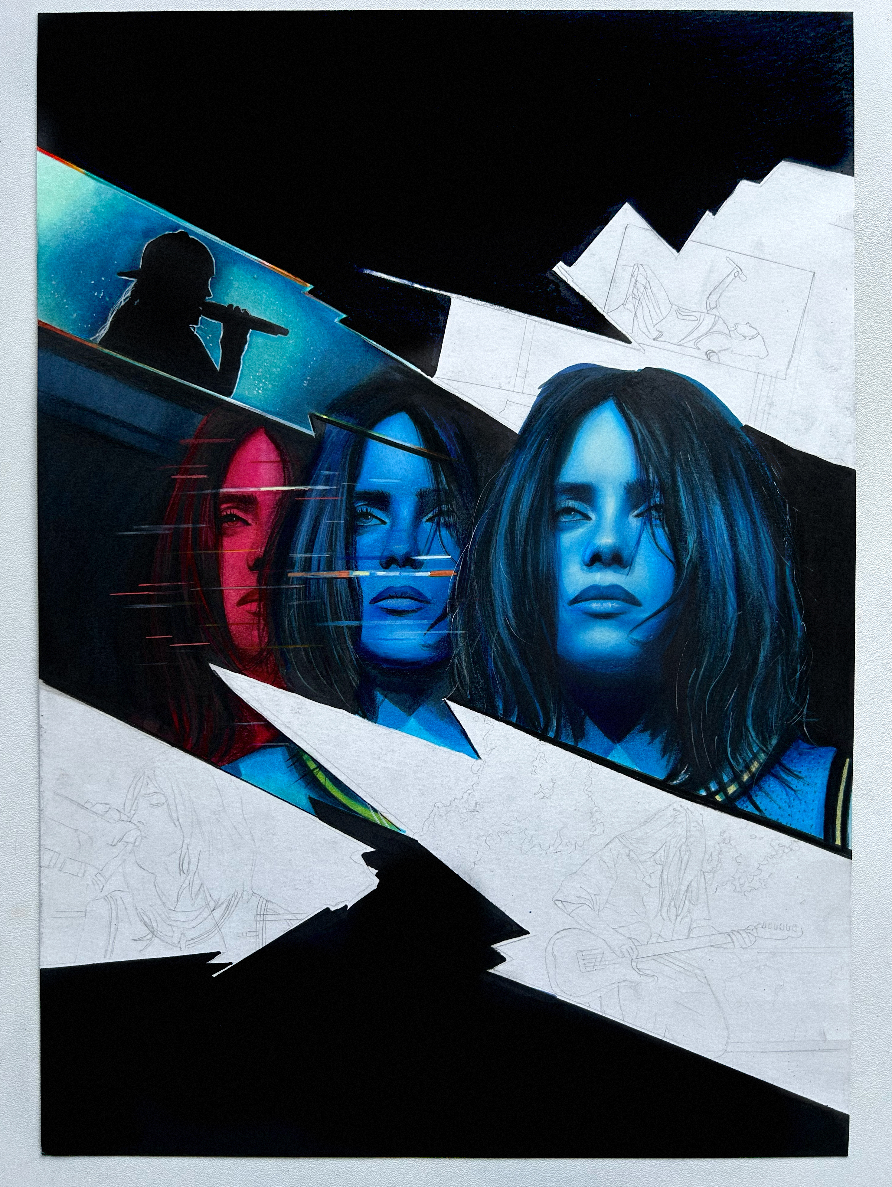
Building the Traditional Artwork
Traditional drawing stage on heavy paper using alcohol markers and colored pencils. I built up the skin tones and contrast first, while keeping the surrounding elements in pencil.
Digital Editing — Concept 2
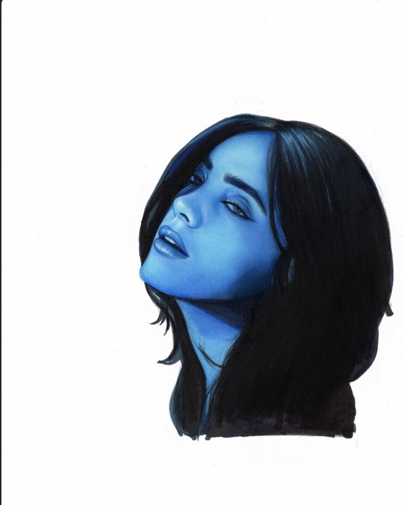
01 · Scanned Drawing
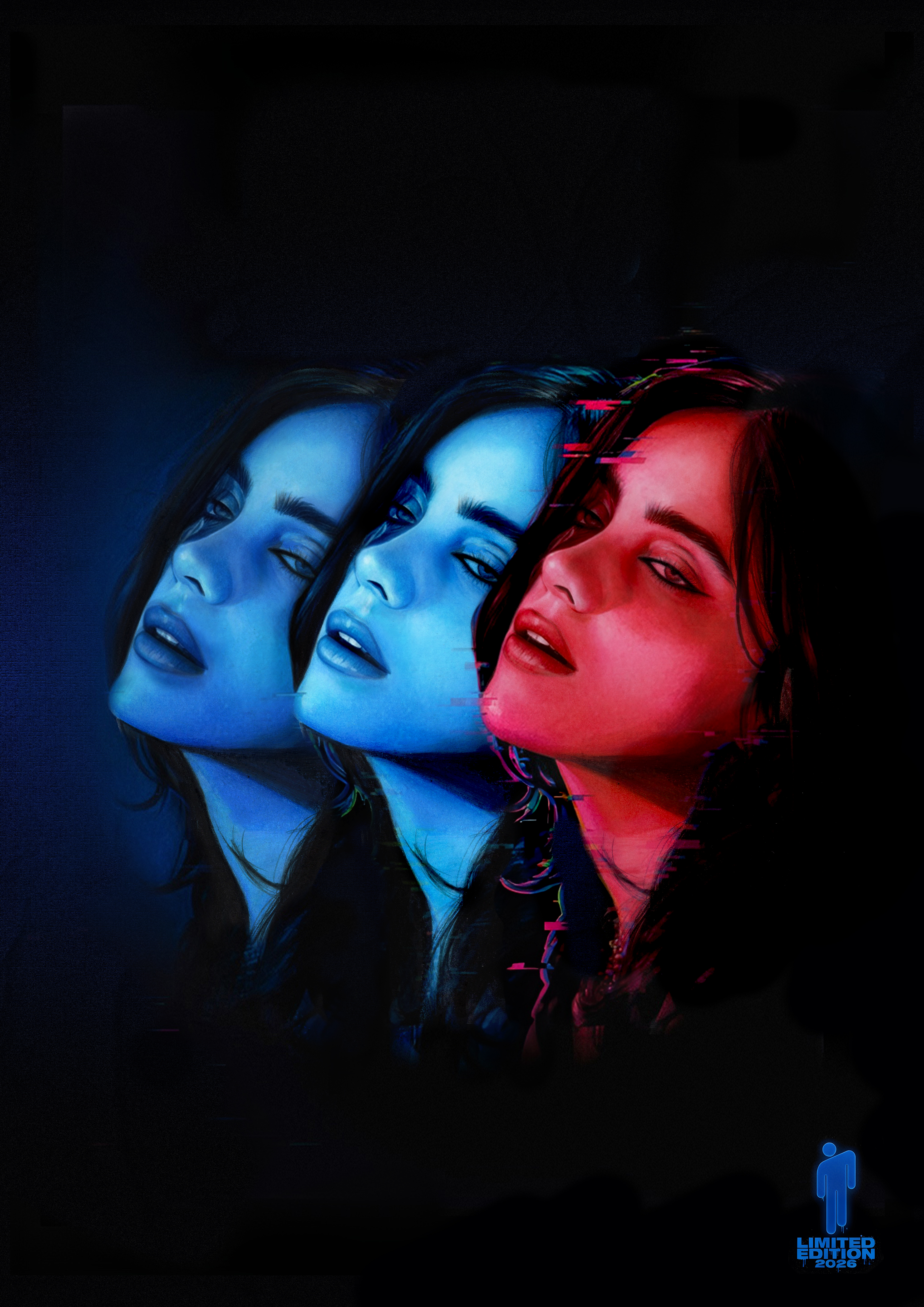
02 · Colour & Contrast Edit
03 · Final Glitch & Typography
From Physical Scan to Cinematic Key Art
After scanning the traditional drawing, the images were taken into Photoshop for color grading, glitch effects, contrast, adjustments and integrating typography so the poster would feel cinematic.
Working on the glitch treatment was a chance to experiment and learn new techniques while keeping the handmade portrait as the core of the image.
This project pushed me to get more experimental with Photoshop effects while still protecting the quality and texture of the original drawing.
Emblem
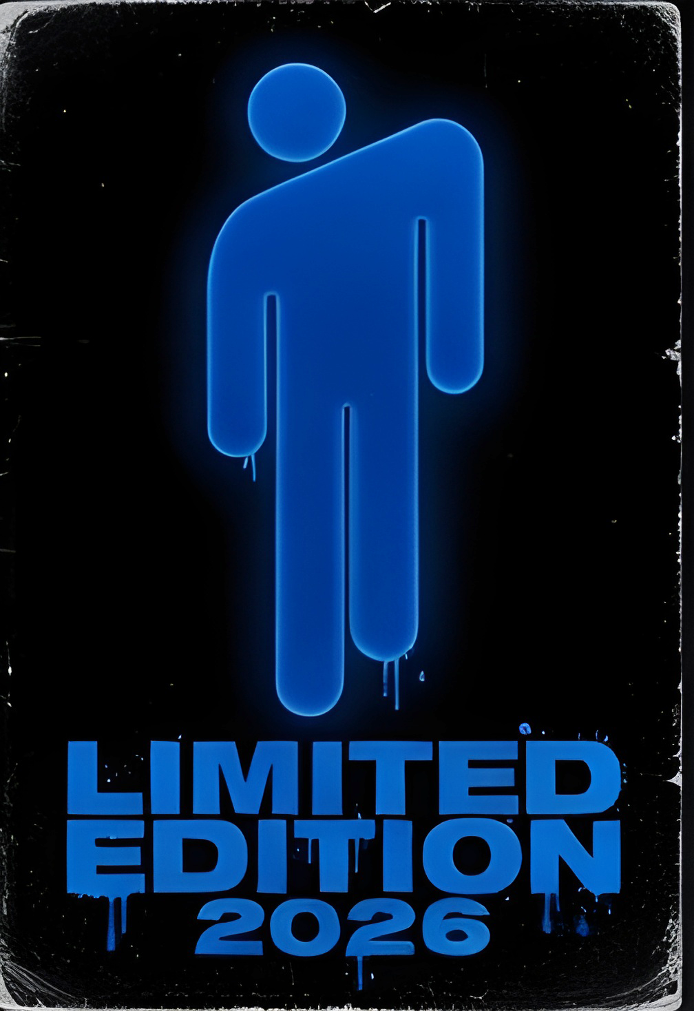
Limited Edition 2026 Mark
A small limited-edition mark was designed for the bottom corner of the poster.
Reflection
Developing two distinct visual directions taught me how flexible a hand-drawn foundation can be when adapting it to different cinematic layouts.
Next time I would push the multi-panel framing even further during the early thumbnail phase.